UI/UX Design
SaaS Dashboard UI
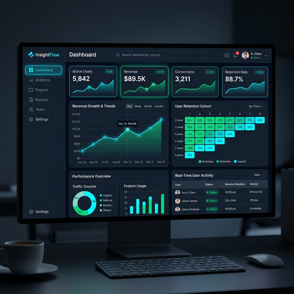
Complete UI/UX design for analytics dashboard
Project Overview
DataMetrics needed a complete redesign of their flagship analytics dashboard. The old interface was cluttered and confusing for users. I completely reimagined the user experience to focus on data clarity, modern aesthetics, and intuitive navigation.
The Challenge
Visualizing complex, high-density data sets without overwhelming the user. The dashboard needed to support both light and dark modes flawlessly.
The Solution
I utilized a modular card-based design system and interactive charting libraries. I established a strict color hierarchy to draw attention to critical metrics while keeping secondary data accessible but unobtrusive.
Key Results
- User retention rate improved by 25%.
- Customer support tickets related to "how-to" queries dropped by 40%.
- Successfully implemented a fully responsive design across all device sizes.
Impressed by this project?
Let's build something equally amazing for your business.
Start Your Project